
Autumn dressing often defaults to charcoal, camel, and black. In 2026, however, richer color offers a sharper way forward. Festival Fuchsia (19-2434 TCX), Foxglove (16-1710 TCX), and Acacia (13-0640 TCX) bring energy back to cold-weather wardrobes without losing the control that makes office dressing feel intentional. The key is not to soften these shades until they disappear. It is to give them structure.
That is where eyewear changes the balance. A narrow black cat-eye can ground vivid magenta, a compact gold square can sharpen dusty pink-purple, and translucent amber tortoise can lift a dark coat. This guide to Office Siren glasses styling shows how to work with the season’s strongest shades through proportion, material, and tone. If you are exploring 2026 Autumn Winter Pantone Colors, these three looks offer a practical place to begin.
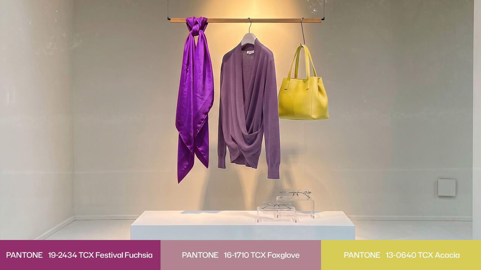
High-Saturation Color & the 2026 Office Siren Aesthetic
The Office Siren look borrows from late-1990s corporate dressing: close tailoring, pencil skirts, sheer hosiery, narrow eyewear, and a palette that feels exact rather than decorative. Its appeal lies in tension. The clothes may follow familiar workplace codes, but the fit, shape, and accessories make those codes feel more self-aware. A frame does not simply finish the outfit; it controls where the eye lands.
That control matters when working with jewel tones. Festival Fuchsia has a saturated, almost electric presence. Foxglove is quieter, with a gray-pink cast that reads thoughtful rather than sweet. Acacia brings a clear yellow note that can wake up charcoal and black. Together, they expand the language of high-saturation color styling beyond a single bright dress or a loud accessory.
The most useful rule is to create contrast with purpose. If the clothing is vivid and body-conscious, choose a dark frame with a clean, narrow outline. If the color is soft or muted, introduce firmer geometry through metal. If the outfit is mostly dark, let a translucent frame repeat one bright accent. This is how glasses for bright jewel-tone outfits can bring order to color instead of competing with it.
Lens color also changes the result. A clear lens keeps the styling crisp and work-ready. A 10% to 15% pale pink tint creates a subtle tonal wash while leaving the eyes visible, which suits the controlled sensuality of the Office Siren mood. Vooglam’s frame variety and tint options make it possible to adjust that effect to your wardrobe rather than treating the trend as a fixed uniform.
Styling Guide & OOTD Lookbook for Statement Tones
Each of the following outfits uses the same method: begin with one dominant Pantone shade, keep the supporting pieces controlled, and choose eyewear that either anchors, sharpens, or repeats the color. The result is expressive, but every element still has a job.
Look 1 - The Festival Fuchsia Office Siren
Start with a Festival Fuchsia fitted pencil-skirt suit, then add sheer black tights and pointed stilettos. The saturated magenta already carries visual force, so extra jewelry is unnecessary. A black flat cat-eye frame with a substantial acetate rim gives the face enough definition to hold its own against the suit. The narrow silhouette also echoes the lean, elongated shape of the skirt and shoes.
This is the strongest example of Office Siren glasses styling because the frame acts as a visual anchor. Without it, the eye may move straight to the clothing, especially when the fuchsia covers most of the body. The black frame returns attention to the eyes. Its slim upsweep adds a controlled sense of drama, while bright gold rivets at the end pieces answer the richness of the magenta without introducing another full color.
This pairing also shows how to style the best eyewear for a 90s Office Siren aesthetic: do not match the frame to the outfit too literally. Use black to contain the high chroma and gold to create a small point of connection. The result feels sensual but measured, with the kind of cool authority that makes Festival Fuchsia wearable beyond a party setting.
Look 2 - The Foxglove Intellectual Look
Foxglove works differently. Its dusty pink-purple tone has softness, but the gray undertone keeps it from becoming sugary. Build the look with a Foxglove cashmere cardigan, dark gray pinstriped trousers, and patent leather loafers. The mix of knitwear, tailoring, and glossy leather already creates texture, so the eyewear should add definition rather than more volume.
Choose a compact gold square frame with black temples. The straight metal edges place a clear boundary around the eyes and counter the cardigan’s soft hand. Black temples connect naturally to the charcoal trousers and loafers, while the gold front adds warmth near the face. Small engraved details at the hinges reward a closer look and reinforce the refined side of the 90s intellectual aesthetic.
For the office, wear the cardigan buttoned with little or no jewelry. For dinner after work, open the neckline slightly and add one dark leather bag. The frame’s firm geometry keeps both versions composed. This is high-saturation color styling at a quieter volume: Foxglove carries the color story, while the eyewear gives it discipline.
Among glasses for bright jewel-tone outfits, this black-and-gold square is the rational counterpoint. It does not repeat Foxglove exactly. Instead, it translates the color’s intelligence into sharper shapes and controlled contrast. The effect is thoughtful, feminine, and composed rather than overly formal.
Look 3 - The Acacia Accent Look
Acacia is best used as a flash of light within a darker outfit. Try an Acacia wool scarf or fine-knit top under a deep charcoal coat, then finish with straight cigarette trousers. Because the yellow occupies a smaller area, it reads as an intentional accent rather than the entire story. The outfit stays grounded, but the face needs one more warm note to prevent the coat from feeling heavy.
A bright yellow-brown amber tortoise square frame provides that note. Its translucent acetate repeats the warmth of Acacia without looking flat or overly matched. Variations in the tortoise pattern create depth, while the square shape gives the softness of the color a clearer boundary. A gold metal inner rim adds another layer of structure and catches light around the eyes.
This tone-on-tone approach is especially effective for 2026 Autumn Winter Pantone Colors because it uses color in measured steps. Acacia appears first in the scarf or knit, then returns in the amber frame at a slightly deeper value. Charcoal separates the two warm elements and gives the eye space to read them. The result is bright but not busy.
The frame also solves a common winter problem. High coat collars and dark outerwear can crowd the lower half of the face, particularly when a scarf adds more volume. Translucent amber opens the area around the eyes, while the gold inner rim provides enough definition to keep the frame from disappearing. It feels lighter than an opaque dark frame, yet more substantial than a thin wire style.
Keep the lens clear and let the acetate do the color work. Vooglam’s square glasses and vintage-inspired eyewear offer useful starting points for comparing color, material, and scale.
Conclusion
Across these 2026 Autumn Winter Pantone Colors, eyewear has a clear role. A black cat-eye grounds Festival Fuchsia, a black-and-gold square focuses Foxglove, and amber tortoise lifts Acacia against charcoal.
That is the central principle behind Office Siren glasses styling: use the frame to balance the outfit’s energy, not merely to match its color. Shape creates control, material sets the mood, and a subtle tint can adjust the final level of drama. Explore Vooglam’s color and lens options to find a combination that works with your own wardrobe. The right frame turns statement color into something personal, practical, and ready for repeat wear.
FAQ
Q1: Will heavy black frames compete with a high-saturation color such as Festival Fuchsia?
Usually, the opposite happens. A clean black narrow frame gives the face a strong visual anchor, which prevents a vivid outfit from pulling all attention below the neckline. The key is proportion: choose a controlled, streamlined shape rather than a frame with too many decorative elements. A flat cat-eye with a small gold accent can return focus to the eyes while still acknowledging the richness of the clothing. Keep jewelry minimal and let that black-and-gold contrast organize the look.
Q2: How can I wear bright yellow tortoise frames with colorful clothing without making the outfit look chaotic?
Limit the main bright clothing color to one area, such as an Acacia scarf or knit top, and keep larger pieces in charcoal, black, or another neutral. The amber tortoise frame can then repeat that yellow in a deeper, patterned form. Because the coat and trousers create visual space between the two warm accents, the repetition feels intentional. Avoid adding a second strong hue; let differences in transparency, texture, and value create the variation instead.